My Role
UX Designer
Tools Used
- Figma for building the prototype
- FigJam for journey mapping
- Google Forms for respondent survey
- Stock Images for app imagery
For the event goer who doesn’t have time for a complicated ticket buying experience and wants to stay in touch with their community. Rock On: Streamline your personalized ticket buying experience for you and your friends.
The Problem
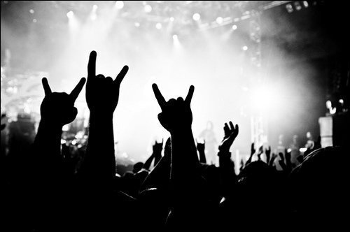
Attending live events is one of my favorite things to do with family and friends. From an early age, I fell in love with the atmosphere and culture that makes up a performance, concert, festival, or any other live event. One downside to making this a truly enjoyable experience is the process of purchasing tickets. It can be cumbersome to navigate through multiple screens and contend with ads in awkward places. Having used my fair share of ticketing apps, I wanted to create something that was simple and intuitive to use while allowing users to connect with other event goers.
The Solution
Rock On– a ticketing app that cuts out the business of traditional ticketing applications and focuses on streamlining personalized event recommendations.
The Process
I created this project for the Coursera Google UX Design Certificate Program. I selected this project from a list of prompts and chose this prompt because of my life for live events.
I researched competitors to understand what functionality and features exist in the event ticketing space and planned how I can build an app that would set itself apart.
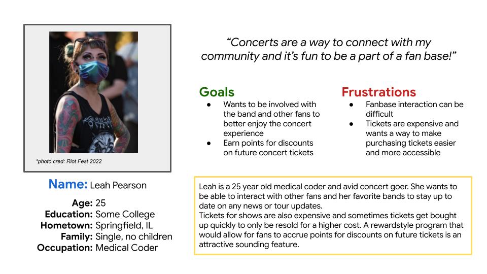
I drafted user personas and journey maps to establish key demographics and understand a user’s journey throughout the process of purchasing tickets. In doing this work, I laid a foundation to understand the needs of my user base.
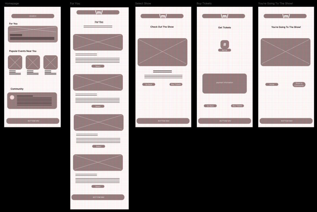
I drafted wireframes based on a ticket buying flow through the “For You” pathway.
I did initial user testing based on these wireframes. From insights learned from this first round of testing, it was observed that:
- 3 out of 5 (60%) participants had concerns navigating the app based on buttons, placement, or lack thereof.
- To address this, I had to rethink the placement and purpose of buttons used in the app.
- 4 out of 5 (80%) participants voiced their concerns about not having a clear confirmation.
- To address this, I will need to design a confirmation page.
- 4 out of 5 (80%) participants mentioned wanting to see variation in the events offered.
- In the MVP, I will showcase concerts, live events, and theatre offerings.
- 5 out of 5 (100%) participants indicated they wanted to be able to control the exact number of tickets purchased.
- In the MVP, I will include a drop down to demonstrate the ticket selection process.
- 3 out of 5 (60%) participants noted they wanted to share their purchases on the community hub.
- In the MVP, I will design a Community page to demonstrate how this feature works.
I made my MVP in Figma. I built out the customized show recommendations in the “For You” ticket purchase flow to demonstrate the process of buying tickets. I also build a mock-up of the “Community” page to display the community feature of the application. In future iterations, I will build out the “Events Near You” pages, incorporate a “Share” to social media function, implement a point system, and build out a feature for tour and box office managers to track ticket sales.
I did secondary user testing on the MVP and received valuable feedback. In the insights from the second round of user testing, it was observed that:
- 1 out of 5 (20%)participants had issues with the drop down ticket menu.
- I made minor adjustments to this component to make sure the variants were linked correctly. Upon further testing this feature is working again.
- 1 out of 5 (20%) participants had concerns navigating the app based on buttons, placement, or lack thereof.
- I made changes to the height of the “Select Tickets” drop down to make it better match the existing buttons. I also experimented with and included an HSL hover variant to the button component to mimic more standard button selection experience.
- 1 out of 5 (20%) participants voiced their concerns about not having difficulty navigating to the home screen with the bottom navigation.
- I updated the bottom navigation bar to include a “Home” button instead of having the “Home” button only at the bottom of the page or accessible only through the main menu.
- 5 out of 5 (100%) participants mentioned ease of navigation.
- This was positive feedback that enforced the design choices made.
Takeaways and Next Steps
Takeaways
- Design System
- Design systems matter! I started working on this project without a design system in place and didn’t anticipate how many obstacles could have been avoided had I put in the time to develop this prior to beginning the minimum viable product (MVP). Only after having made many minor adjustments to my MVP after implementing a design system did I realize just how important design systems are to the overall impact of a product. In future design work, I would dedicate time to building this documentation at the beginning of the process.
- Prioritization and Time Management
- As my first realized UX Design project, I struggled with knowing how long something would take me to complete and the best way to prioritize certain elements. Because of this, I would be focused on the minutiae of a design element instead of focusing on the bigger picture, or vice versa. I now know that the first attempt may not be the most perfect attempt and that it’s ok because we iterate.
- For future projects, I now have a better sense of how long something will take me to complete. I’ve also gained lots of new knowledge on how to work in Figma and this knowledge has been valuable when it comes to planning out my work time.
Next Steps
- Build out the “Events Near You” pages
- This is the next part of the MVP that needs to be built out to make it a fully functional application.
- Incorporate a “Share” out to social media feature
- Test users have indicated that they would like to be able to share out to other social media platforms. In future iterations this will be considered.
- Implement a point system
- A point system was part of the initial concept for this project. Over time, this feature fell down on the list of priorities and wasn’t top of mind when building out the initial MVP.
- Explore a manage box office function for tour/box office managers
- Building out a box office function for box office and tour managers was another feature that was thought of during the initial design stage but was put on hold to build out the core MVP. In future iterations this feature will be explored as it is imperative that box office and tour managers can keep tabs on ticket sales.
