My Role
UX Designer
Tools Used
- Figma for building the prototype
- Google Forms for respondent survey
- Stock Images for app imagery
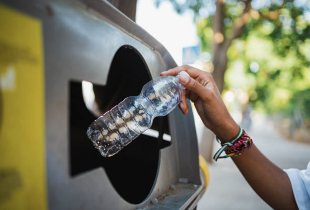
Recycle It, an app designed to help users learn more about recycling and develop their recycling habits.
The Problem
I’ve always been a proponent of recycling, but I know that proper recycling habits can be tricky to develop and reinforce. There are different rules for different items, pick-up schedules may not be most readily at hand, and certain large items can be difficult to dispose of; all of this can lead to confusion around recycling.
The Solution
Recycle It is an app that will allow users to learn more about recycling in the their area, enable pick-up notifications, and search for local recycling centers.
The Process
I created this project for the Coursera Google UX Design Certificate Program. I came up with this idea after helping my neighbor understand how to properly recycle some large electronic items they were looking to properly dispose of.
I researched competitors to understand what functionality and features exist in the recycling education space and planned how I can build an app that would be appealing to the average person that would want to learn more about proper recycling habits.
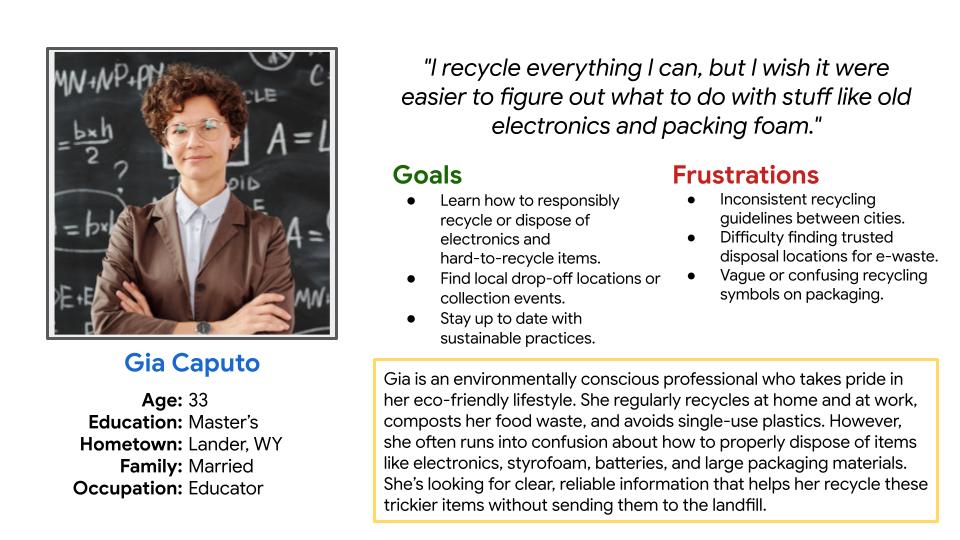
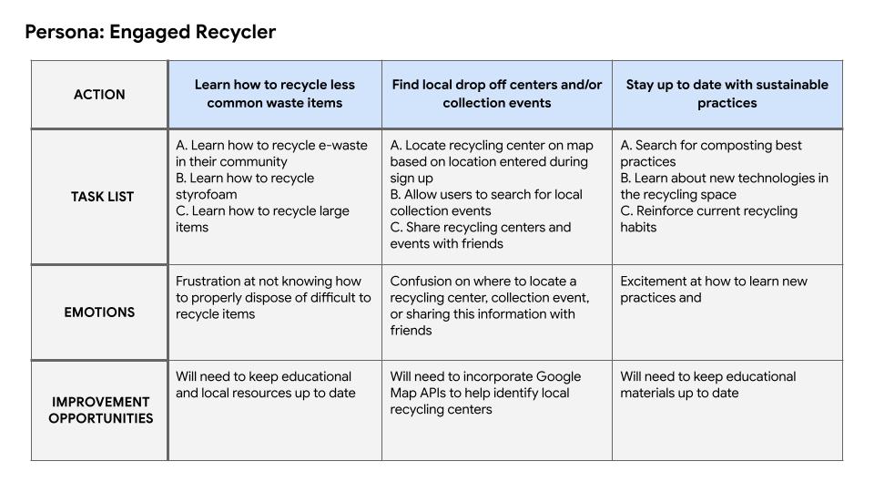
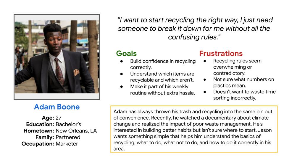
Following this initial research, I drafted user personas and journey maps to establish key demographics and understand a user’s journey throughout the process of learning about recycling best practices.

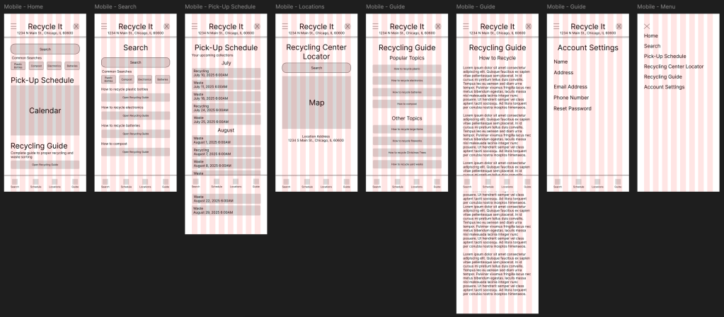
I drafted wireframes based on competitive research and by refining of the features to include in the Recycle It app. Many common features found during my competitive research analysis were pick-up schedule reminders, item search function, and a resource and/or recycling guide.
I created my MVP in Figma, where I used the First Draft AI feature to lay the groundwork for the sign-up and home screens.
For the demonstrated flow, I focused on the process a user would go through to first sign up for the app before being brought to the home screen. From there, users are able to navigate through the app as they so choose.
I did user testing on the MVP and received valuable feedback. From those insights, it was observed that:
- 2 out of 3 (67%) of users used a calendar to track their recycling pick-up
- This reinforces the choice to include a pick-up schedule alert function in the app
- 3 out of 3 (100%) of users cited unclear recycling guidelines as their top frustration with recycling today
- This finding supports the need for a recycling guide and an accessible search feature
- 3 out of 3 (100%) of users found the app to be easy to navigate and use
- This finding supports the established user flow of the app
- 3 out of 3 (100%) of users suggested ways to update the Recycling Guide
- This finding suggests that the Recycling Guide will need to undergo further revision and testing
Takeaways and Next Steps
Takeaways
- Topical Research
- Proper recycling techniques vary from location to location. For this project, I focused on providing general recycling information so that users can learn the fundamentals of building good recycling habits. In a future version of this project I will plan to include more localized recycling resources.
- AI Utilization
- For this project I used the AI First Draft feature in Figma to lay out the sign up and home pages. I did this to lay the foundation of how the final MVP would look when fully realized. Being able to write appropriate prompts was something I struggled with at first, but was able to achieve after several attempts. This is a feature I look forward to utilizing more in future work as I continue to learn more about AI and how to write appropriate prompts.
Next Steps
- Create desktop and tablet views
- I want to demonstrate how this app would function as a standalone website as I would like this to be available to all kinds of users, not just those who are mobile first users.
- Look into incorporating RSS feeds
- This point was raised during user testing and I believe it deserves a thorough exploration. Incorporating an RSS feed that will source information from different municipalities would greatly reduce the amount of manual work needed to update relevant information for each individual location.
- Redesign Recycling Guide
- Several key points of feedback from user testing indicated that users would like to see certain modifications made to the Recycling Guide to make the content more easily digestible. The changes include: adding in a table of contents for each section, including appropriate imagery, and creating a recycling flow chart and glossary. I will plan to include these changes in future iterations of this app.
